BRIEF
Saabi Fried Chicken wanted to build a brand identity that reflected its philosophy of love, passion, and community, while standing out in the highly competitive food and beverage industry. The goal was to position the restaurant not just as a place to eat, but as a destination for memorable culinary experiences.
SOLUTION
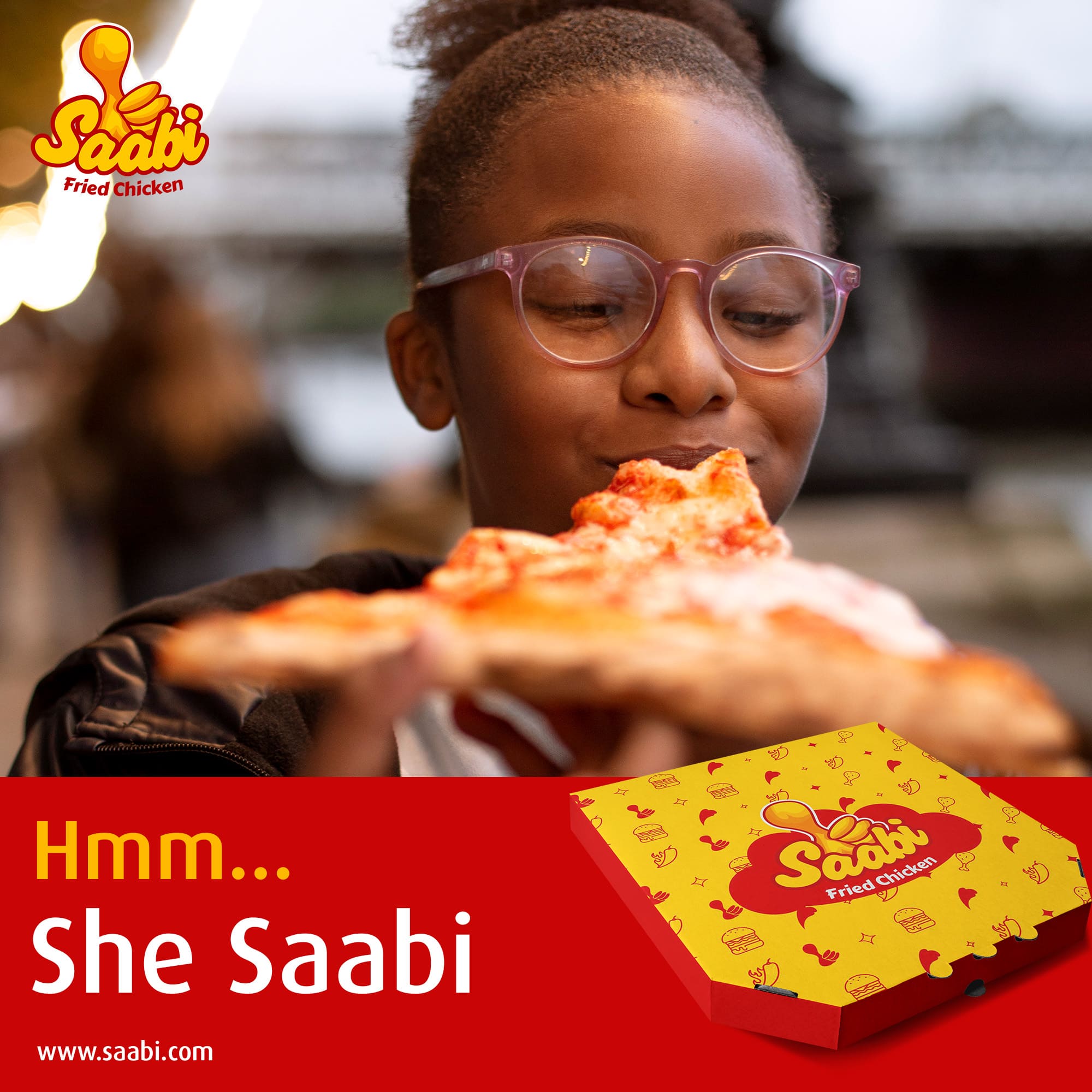
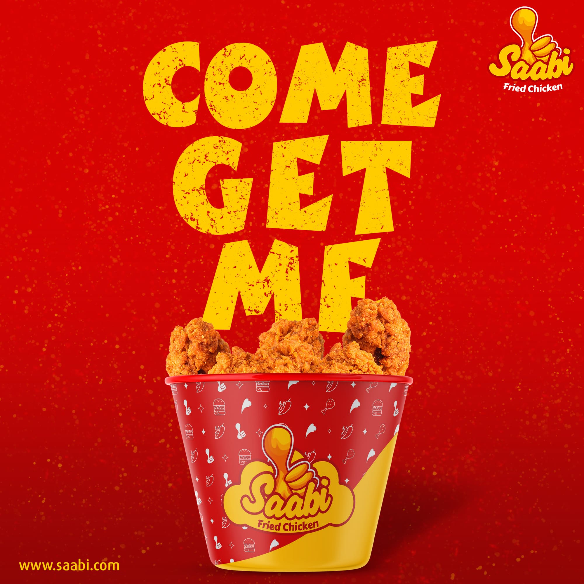
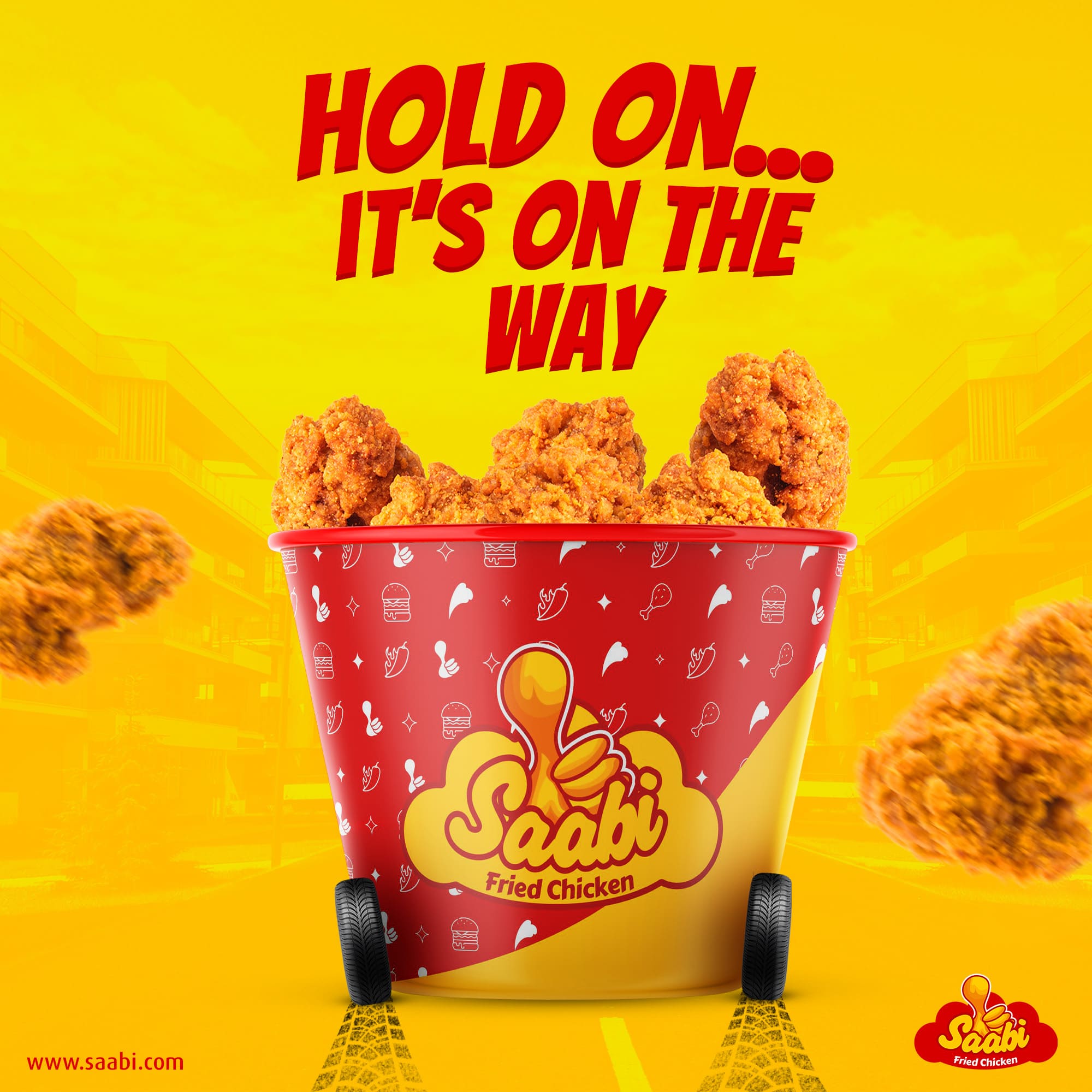
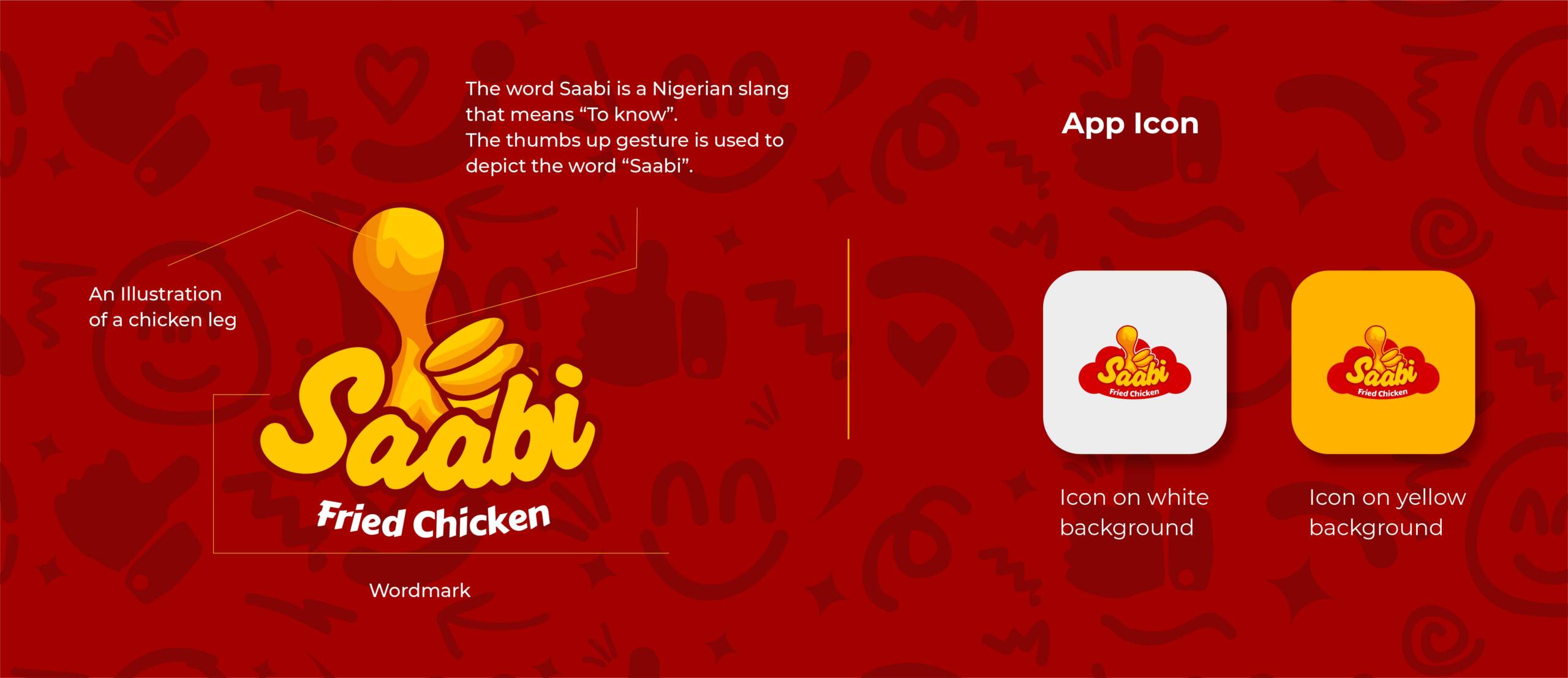
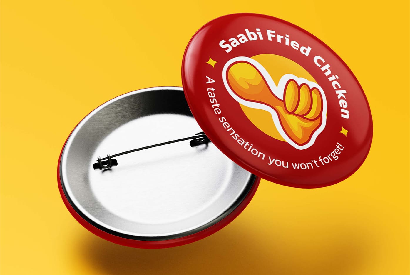
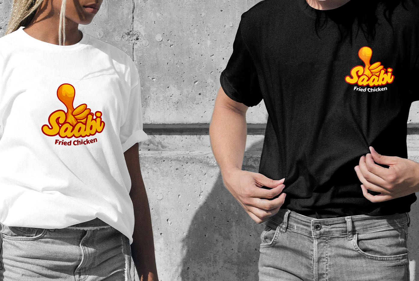
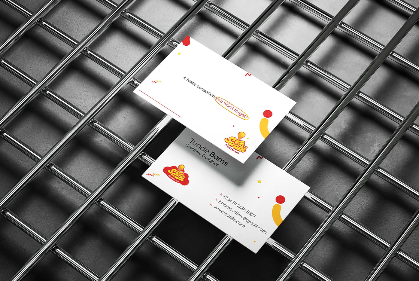
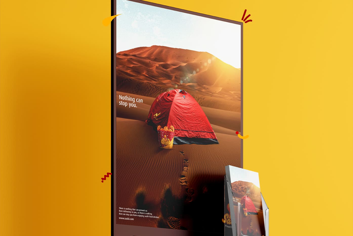
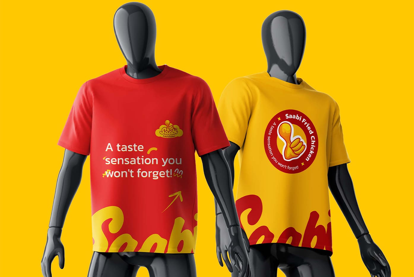
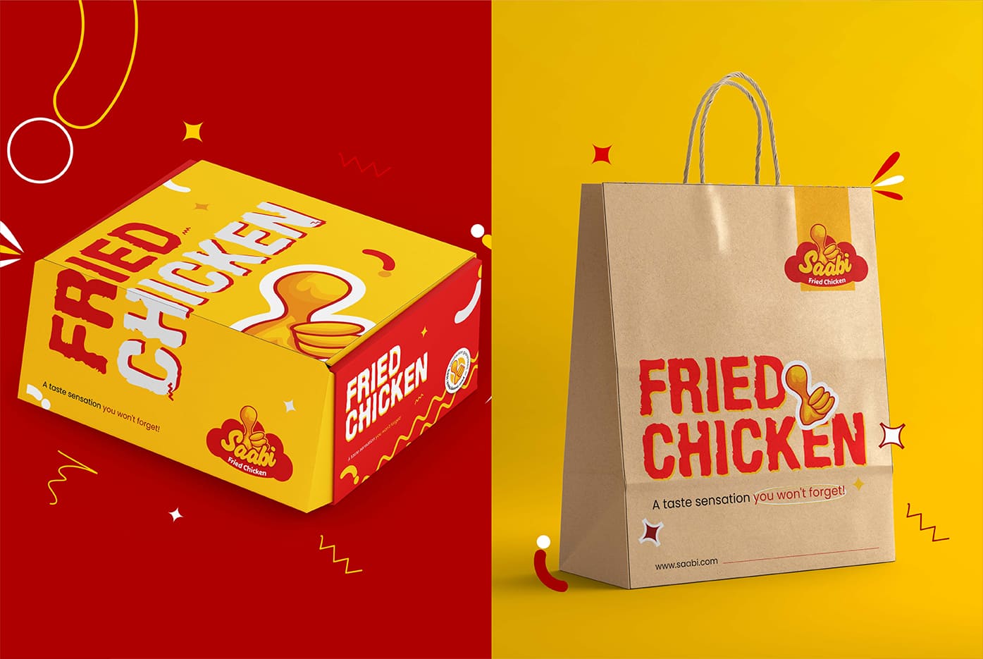
We developed a logo and visual identity system that captured Saabi’s spirit of unity and celebration. The identity was designed to work seamlessly across all touchpoints—packaging, store environments, and digital platforms—ensuring consistency at every stage of the customer journey. The focus was on creating a warm, vibrant, and inviting brand that communicates passion and excellence through design.
RESULT
The rebrand positioned Saabi Fried Chicken as more than a restaurant—it became a community hub where food and connection meet. The cohesive identity elevated customer experiences, making every visit feel memorable, while reinforcing Saabi’s reputation for exceptional flavour, warmth, and togetherness.