BACKGROUND
In a complex and dynamic business environment, individuals, entrepreneurs, and organizations require trusted legal partners who understand their unique needs. Acuity Partners stands out as a leading legal advisory firm, offering premium, personalized services tailored to a diverse clientele, including private clients, start-ups, SMEs, family businesses, family offices, and cooperatives. Acuity Partners combines expertise, innovation, and a deep understanding of its clients’ goals to deliver bespoke legal solutions that drive success and sustainability.
THE BRIEF
Acuity Partners approached Oxxygn Design to develop a rebranding strategy that reflects its premium positioning and personalized approach. The objectives were to:
- Design a sophisticated and timeless logo that conveys trust, expertise, and personalized service.
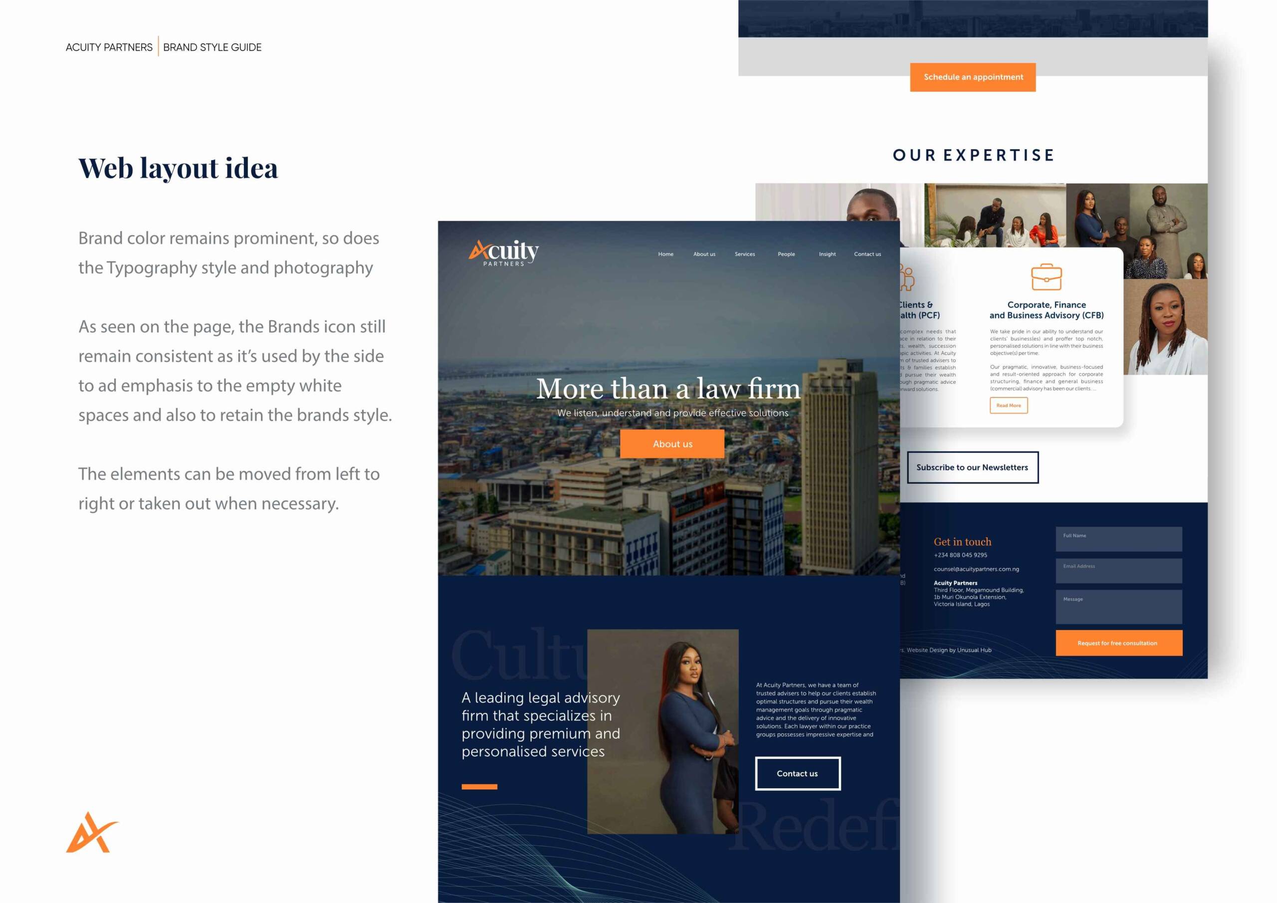
- Establish a visual identity system that communicates authority and approachability to a broad client base.
- Craft a tone of voice that embodies professionalism, innovation, and a commitment to long-term partnerships.
OUR PROCESS
- Research and Discovery: Our work with Acuity Partners began by understanding the unique challenges faced by its diverse clientele, from individuals and entrepreneurs to family businesses and cooperatives. This research illuminated the importance of a brand identity that balances professional gravitas with a personal touch.
- Brand Strategy: We focused on creating a brand that resonates with Acuity Partners’ commitment to bespoke legal solutions and its reputation for reliability and innovation. The strategy emphasized the firm’s deep expertise, collaborative approach, and ability to navigate the complexities of the legal landscape.
- Creative Direction: The creative direction sought to reflect Acuity Partners’ premium positioning through elegant and timeless design elements. The aim was to create a brand that exudes professionalism and sophistication while remaining approachable and client-focused.
OUR STRATEGY
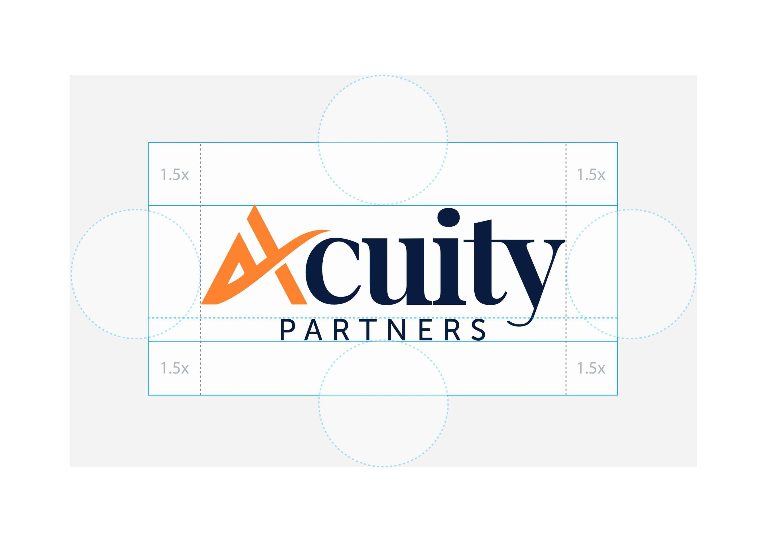
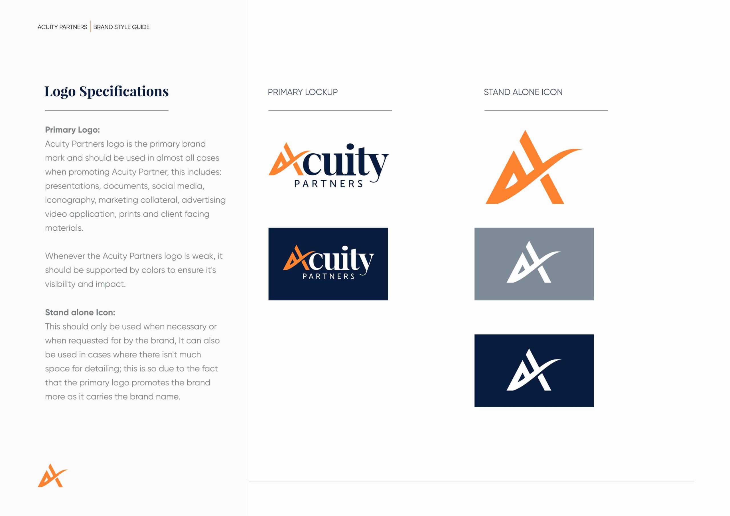
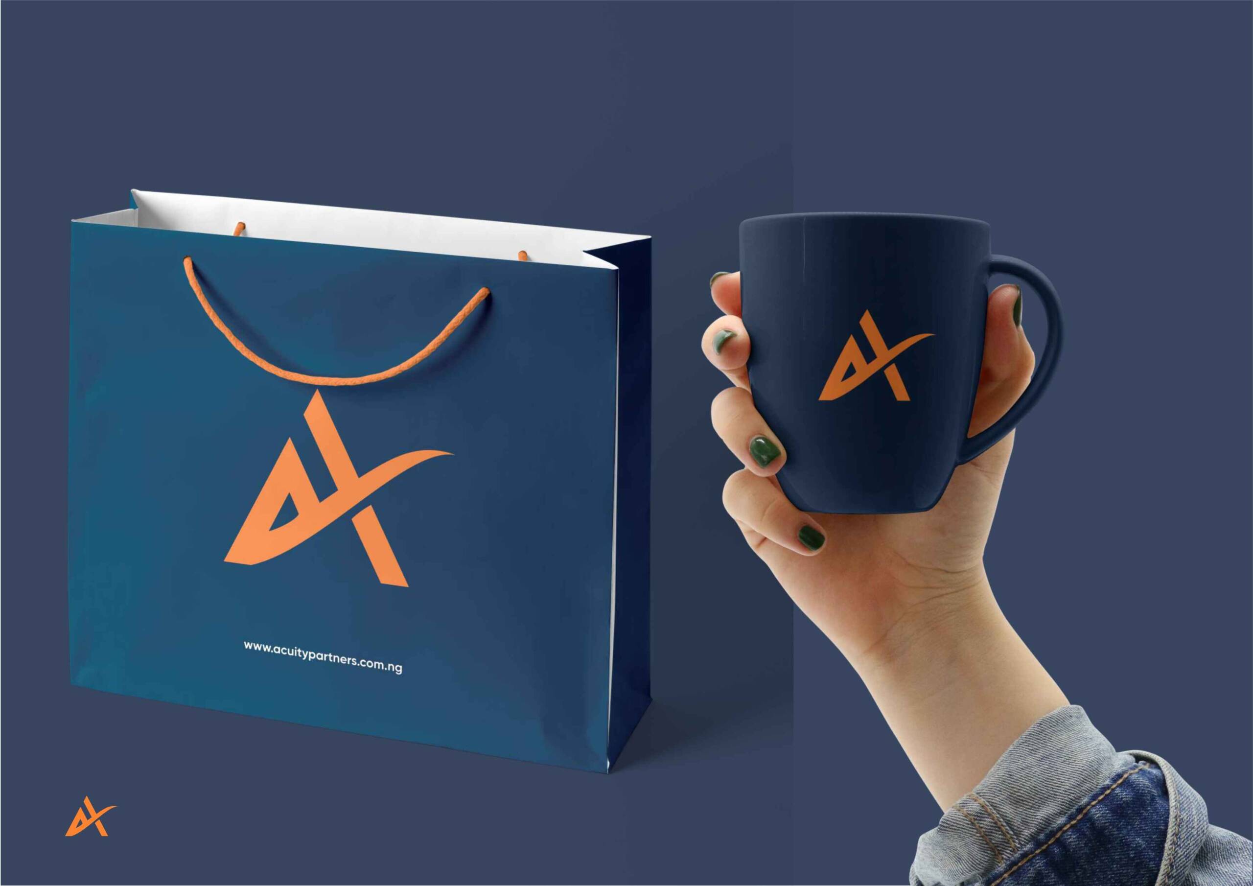
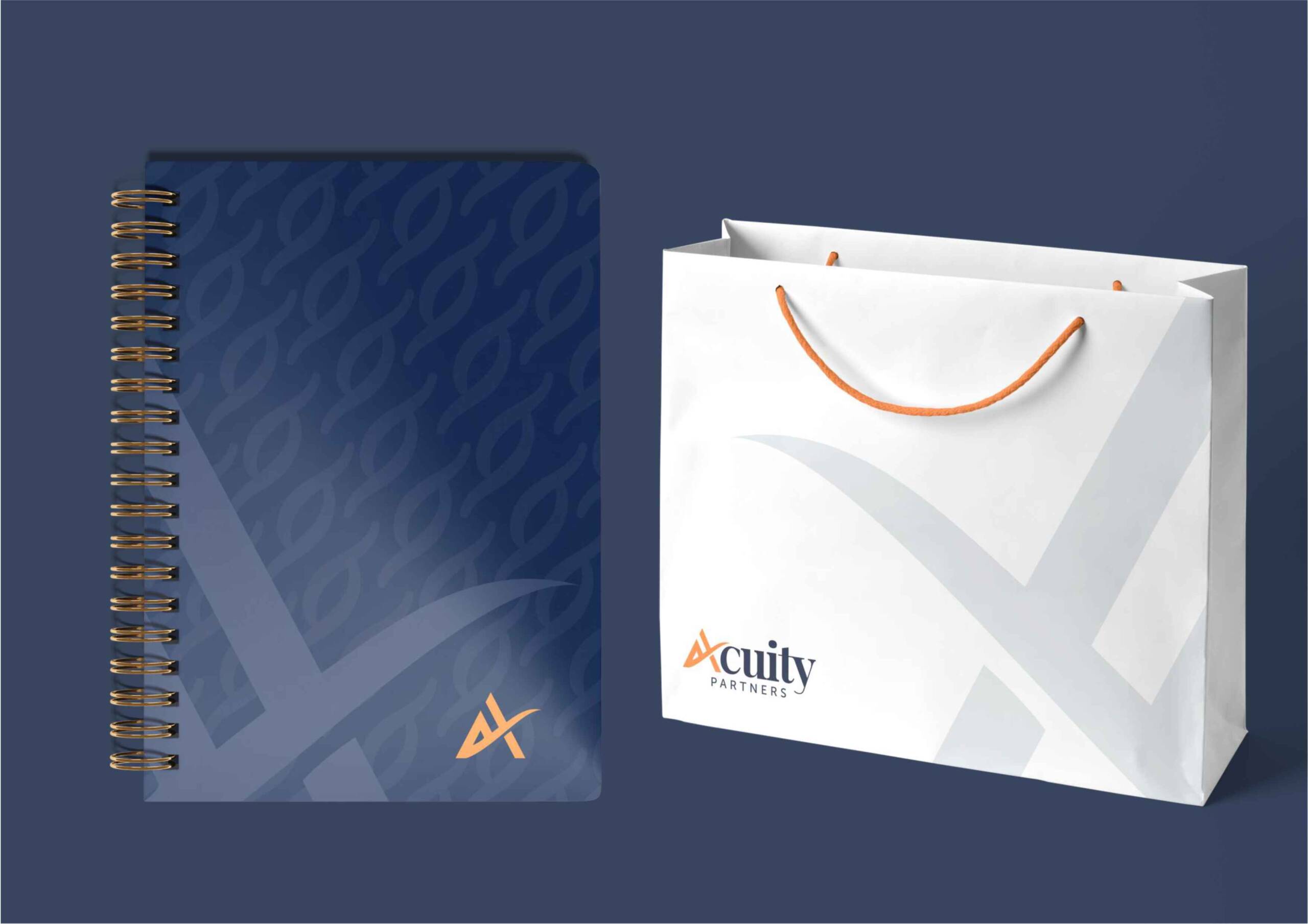
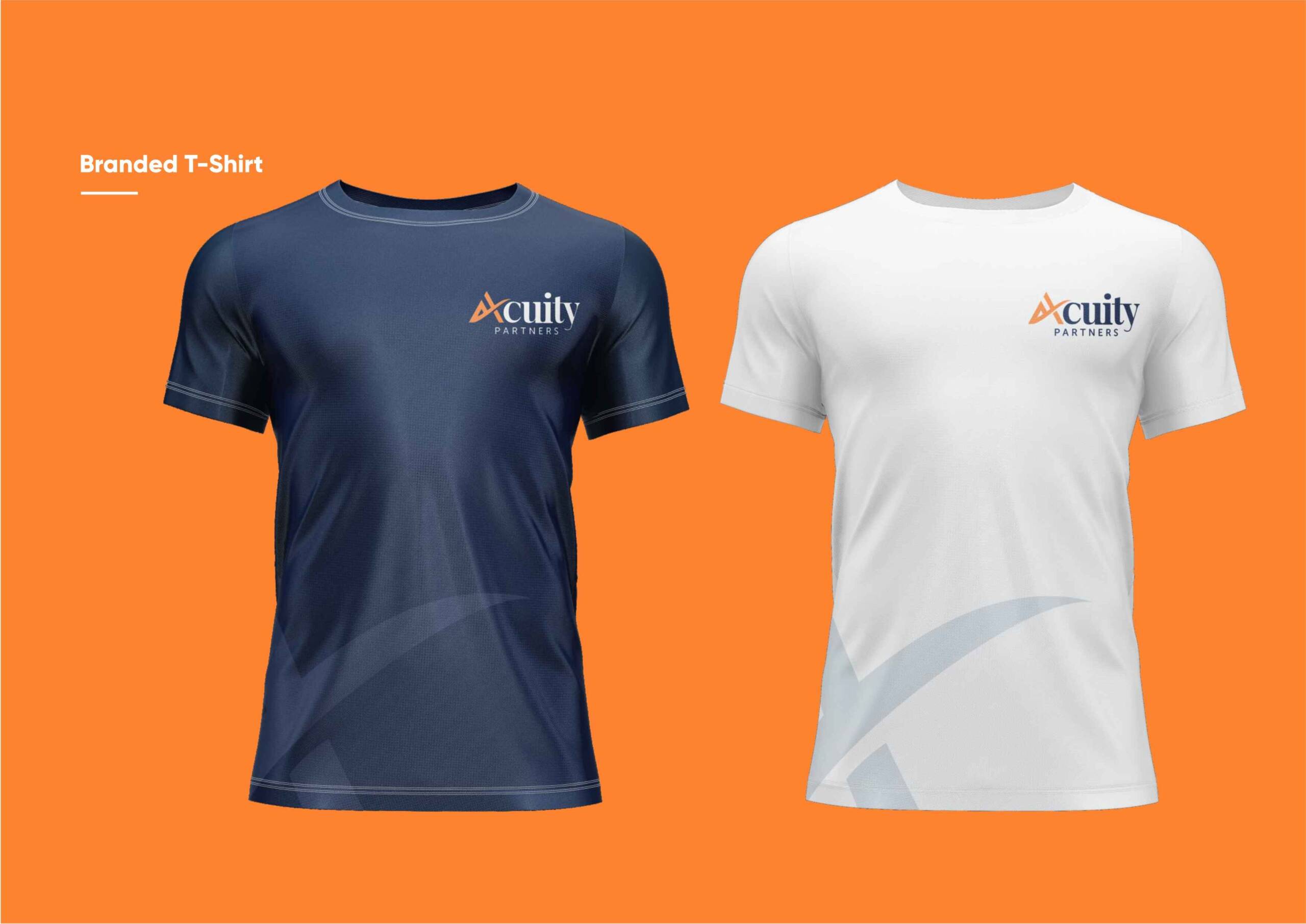
- Logo Design: The logo combines clean, modern typography with a bespoke monogram emblem symbolizing precision and trust. The design incorporates interlocking elements, representing collaboration, strategic thinking, and the seamless integration of Acuity Partners’ services.
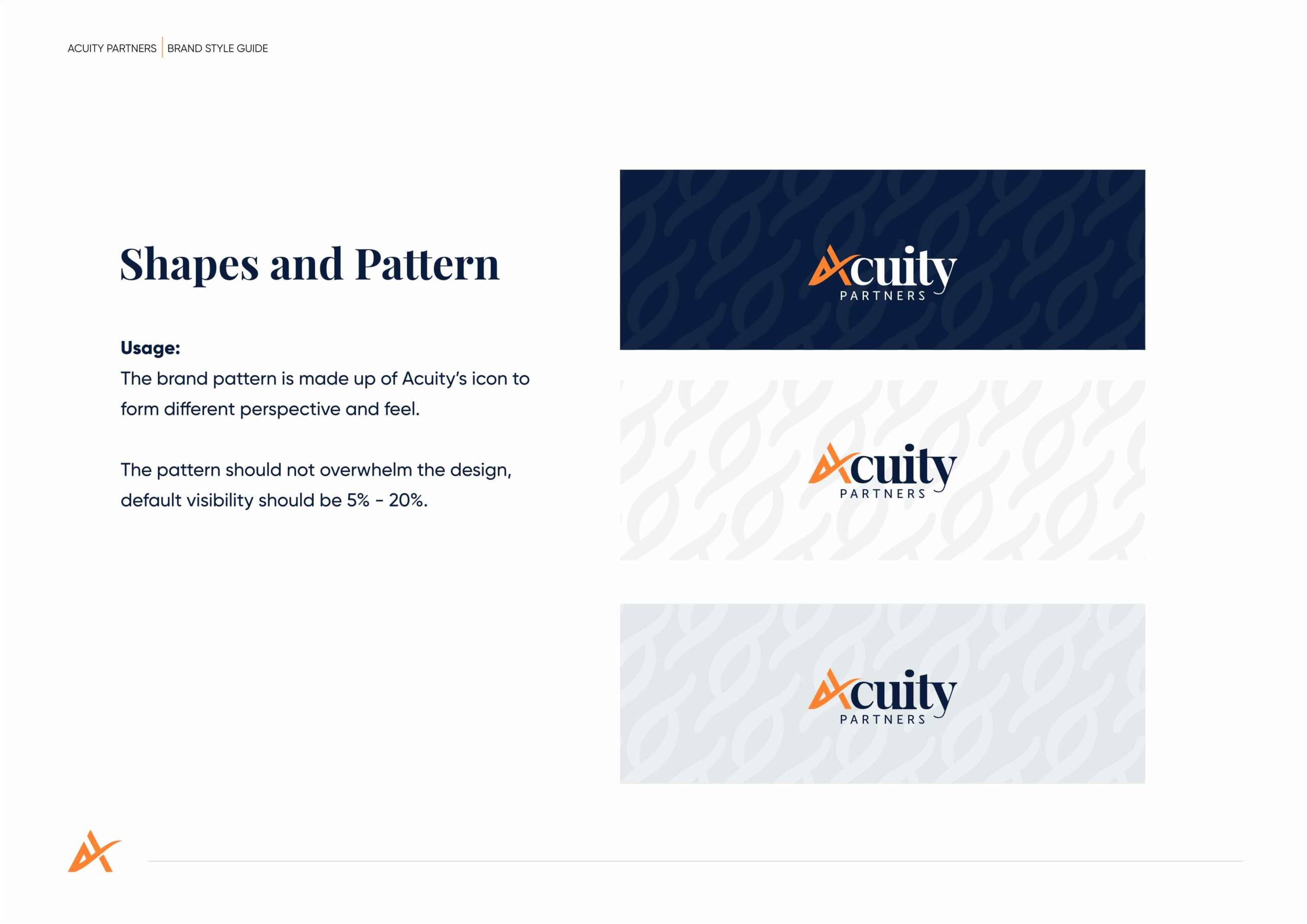
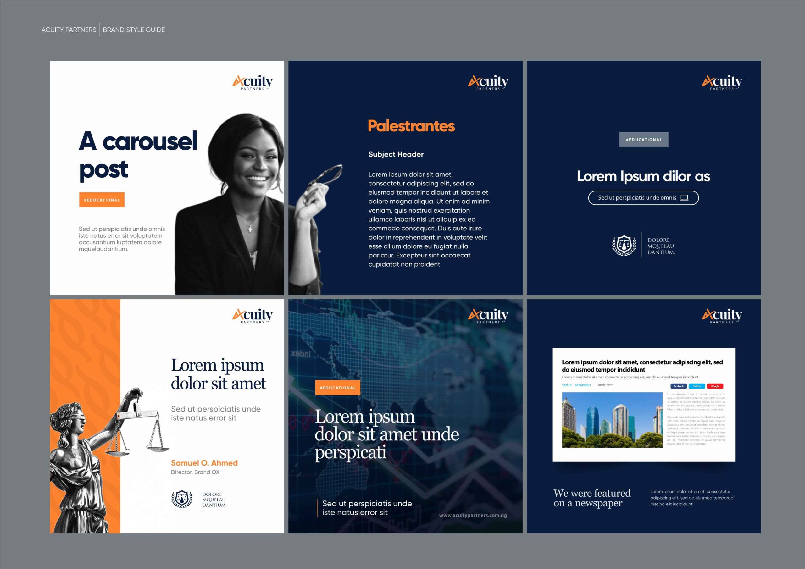
- Visual Identity System: The visual identity features a refined colour palette of deep navy, gold, and soft neutrals, evoking trust, stability, and sophistication. The typography combines classic serif fonts with modern sans-serif accents, creating a balanced and versatile system suitable for digital and print applications.
- Tone of Voice: The tone of voice was crafted to balance authority and approachability, ensuring clients feel confident in Acuity Partners’ expertise while recognizing its dedication to personalized service. Messaging emphasizes clarity, collaboration, and the firm’s commitment to delivering solutions tailored to each client’s unique needs.
RESULTS
- The rebranding solidifies Acuity Partners’ position as a trusted legal advisory firm, appealing to its diverse clientele.
- The refined logo and cohesive visual identity enhance brand recognition and convey the firm’s premium and client-focused ethos.
- Clients now perceive Acuity Partners as a modern, innovative, and approachable partner in navigating legal complexities, strengthening its reputation as a leader in legal advisory services.