

BACKGROUND
The brand focuses on providing health-conscious consumers with a nutritious and flavorful alternative to artificially flavored beverages. Their products contain no artificial color and feature natural extracts such as hibiscus, citrus, and mixed fruits. The brand’s mission is to promote health, refreshment, and natural goodness in every bottle.
THE BRIEF
Cedaa Delight approached our branding agency with the need to design packaging for their line of herbal-infused drinks. The goal was to create a visually appealing, modern, and professional package that aligns with the brand’s identity, communicates its natural ingredients, and stands out on retail shelves.
The project scope was limited to the package design for multiple flavors, ensuring consistency across the product range while allowing differentiation for various flavors.
THE OBJECTIVE
:
- Create a premium, modern, and attractive package design that reflects the natural and herbal nature of Cedaa Delight.
- Ensure flavor differentiation through a strategic use of color while maintaining brand consistency.
- Enhance shelf presence by incorporating a design that draws consumer attention and communicates key product benefits.
- Include all necessary regulatory and product details in a clear and legible format.
- Align with the target audience—health-conscious individuals looking for refreshing, natural drinks.
OUR APPROACH
Our approach to designing the package for Cedaa Delight was structured in the following phases:
- Research & Market Analysis: We conducted a competitive analysis of similar herbal and fruit-based beverages to understand:
- Market trends in beverage packaging.
- Consumer preferences for color schemes and typography.
- Industry best practices for label organization and regulatory compliance.
- Design Concept Development: Based on the research insights, we developed concepts that incorporated:
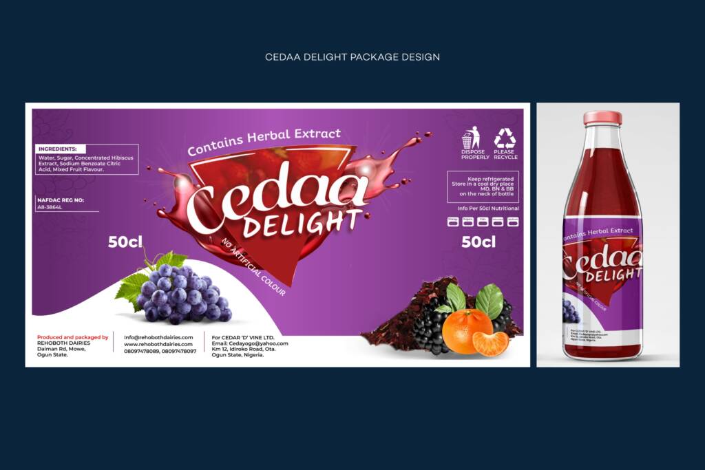
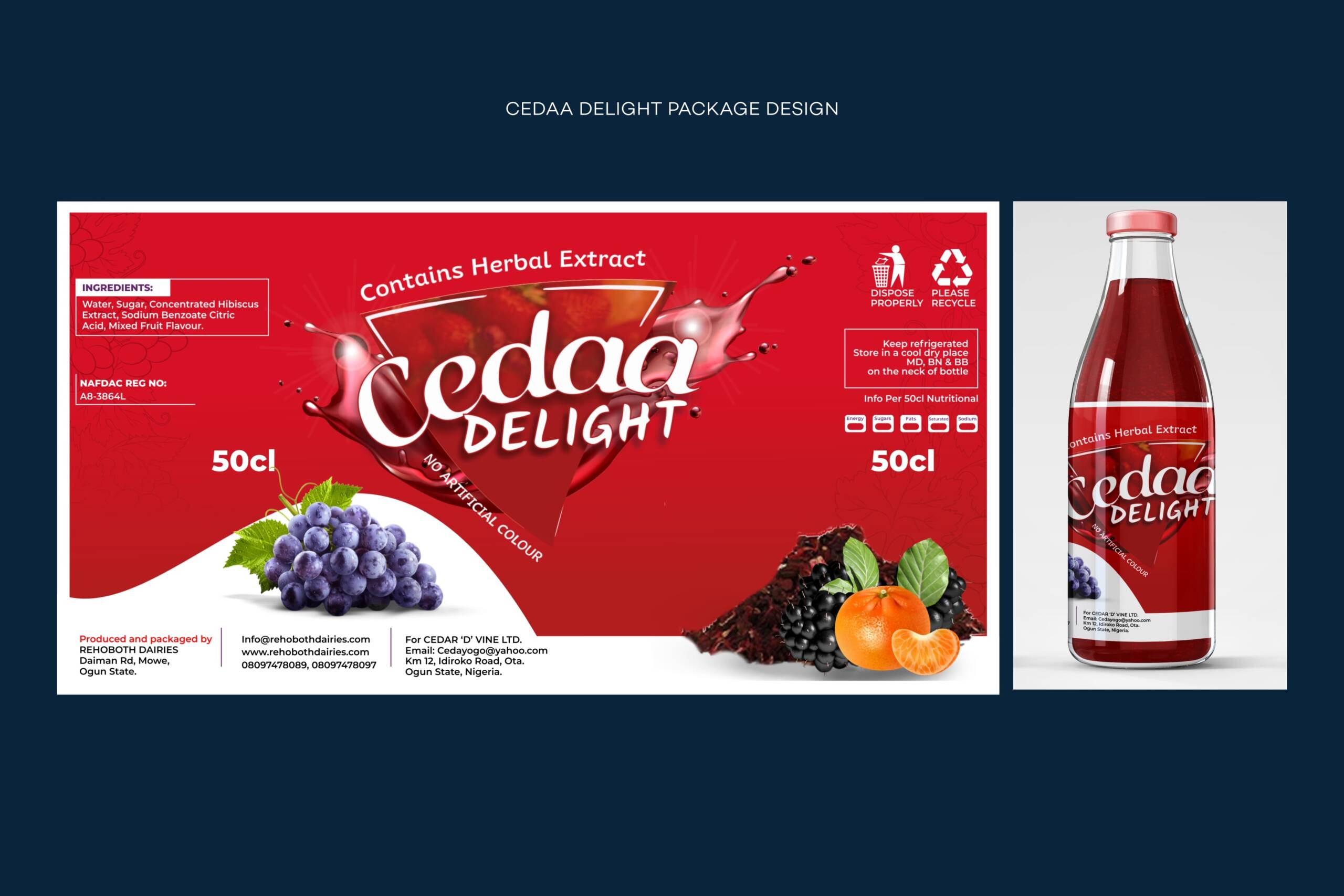
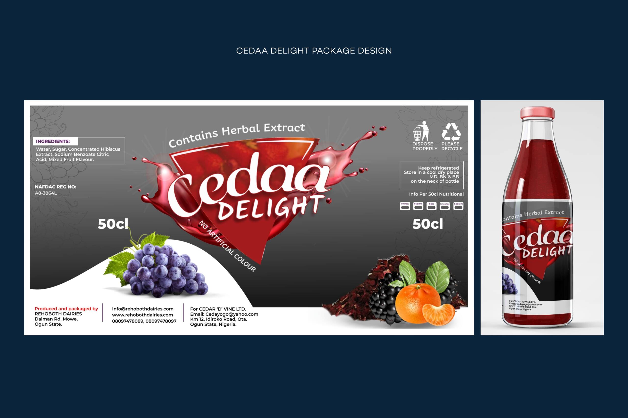
- Vibrant yet sophisticated color schemes to differentiate flavors (purple, red, and gray for different variants).
- A dynamic splash effect behind the brand name to evoke freshness and energy.
- Clear typography and information hierarchy to ensure easy readability of product details.
- Natural ingredient imagery to emphasize the authentic and herbal nature of the drink.
- A sleek bottle label layout that enhances brand appeal and professionalism.
- Design Execution: We created three primary package designs based on the distinct flavors:
- Purple Variant: Representing a blend of hibiscus and fruit extracts.
- Red Variant: Highlighting a bold, vibrant hibiscus and citrus combination.
- Gray Variant: A neutral yet premium design for a special edition flavor.
- Client Feedback & Revisions: After presenting the initial concepts to Cedaa Delight, we refined the designs based on feedback. Adjustments included:
- Enhancing contrast for better readability.
- Refining typography for a more modern look.
- Adjusting color tones for improved flavor differentiation.
- Incorporating additional branding elements for better market positioning.
RESULTS
- The final package designs successfully captured the essence of Cedaa Delight-a natural, refreshing, and health-conscious brand. The vibrant and sleek design ensures that the product stands out on shelves while maintaining an elegant and professional look.
- Through this packaging, Cedaa Delight can now effectively communicate its value proposition to consumers, reinforcing its position in the herbal beverage market.