

BACKGROUND
With a strong emphasis on freshness and natural ingredients, Dairy Fresh aims to create products that offer a perfect balance of taste and health benefits. The brand is built on values of quality, authenticity, and innovation, ensuring that every sip of its yogurt embodies the purity of dairy excellence.
THE BRIEF
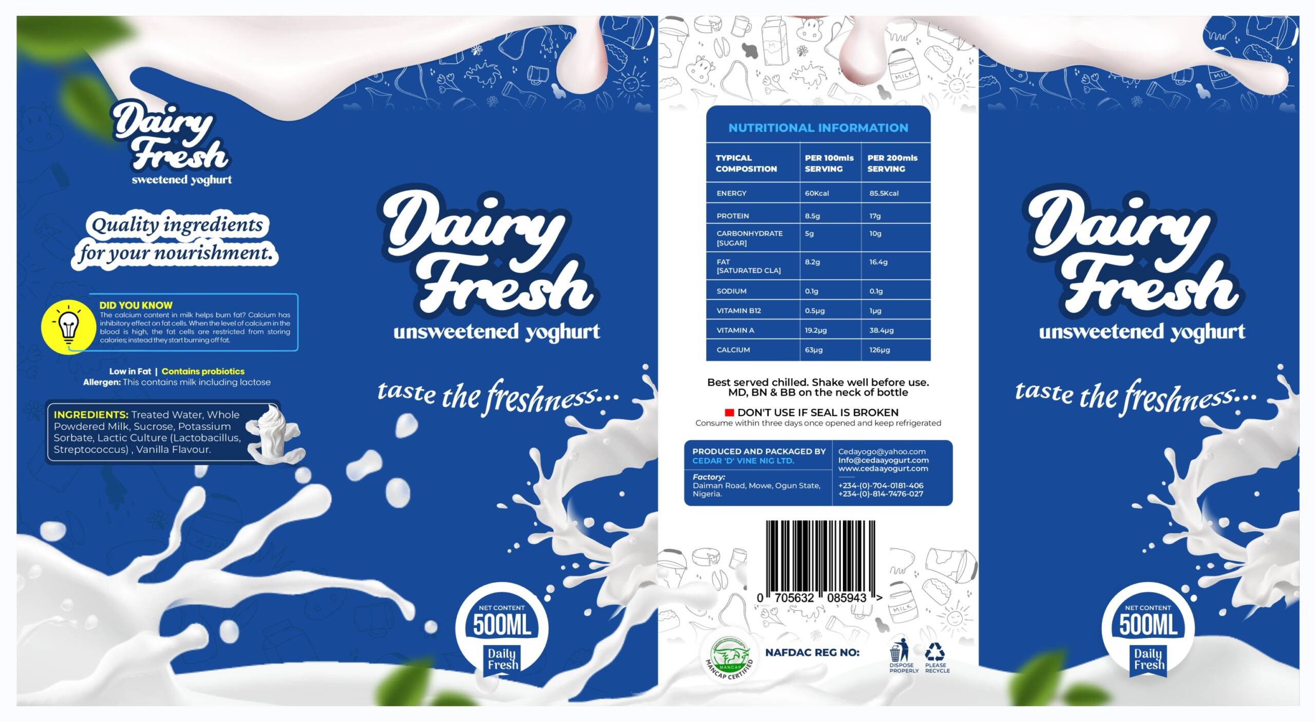
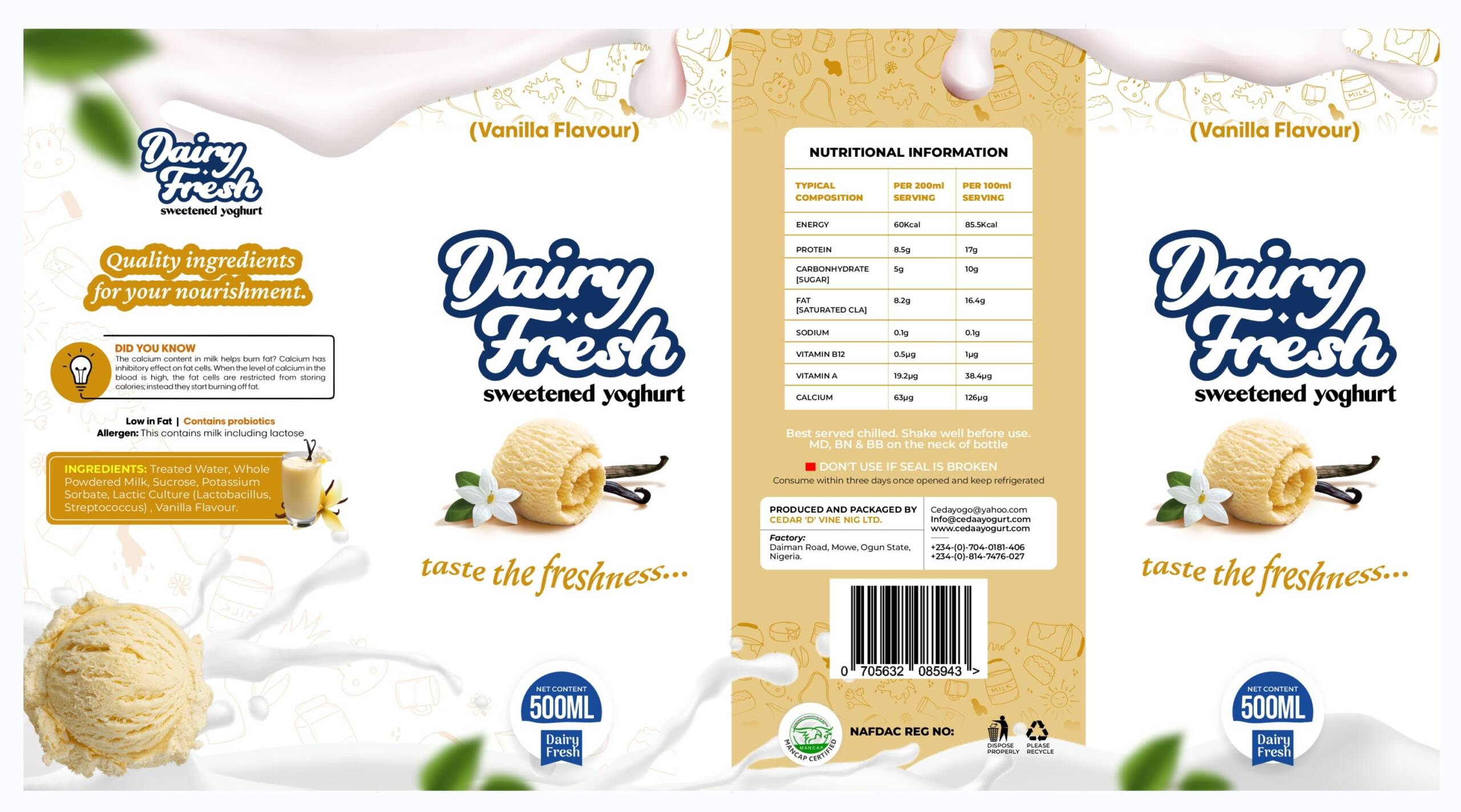
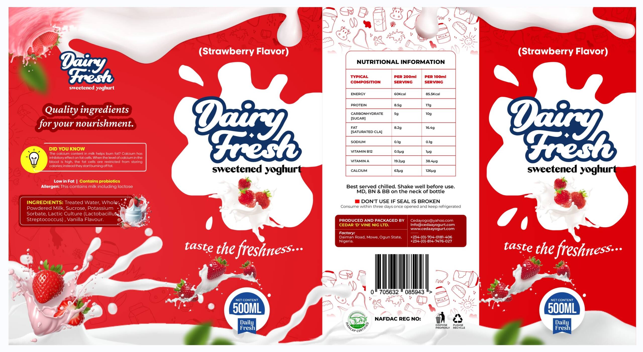
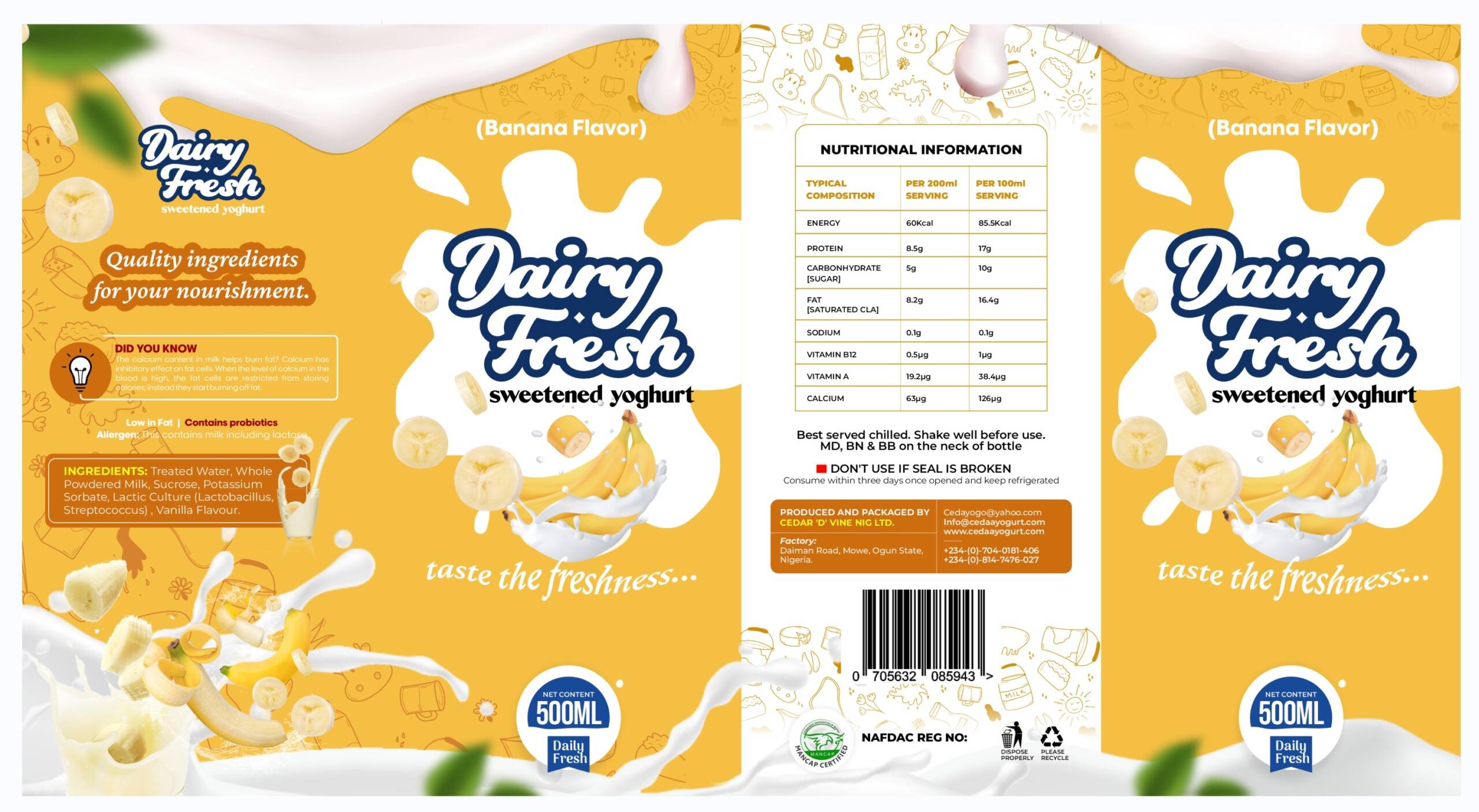
Our branding agency was approached to develop an engaging and visually appealing package design for Dairy Fresh’s yogurt product line, which includes four distinct flavors: Unsweetened, Strawberry, Banana, and Vanilla. The goal was to create a consistent, premium identity that communicates freshness, taste, and the wholesome goodness of dairy products while differentiating each flavor effectively.
THE OBJECTIVE
:
Dairy Fresh required a packaging solution that would:
- Enhance brand recognition and shelf appeal.
- Communicate freshness and quality.
- Differentiate the four yogurt flavors while maintaining a cohesive brand identity.
- Appeal to health-conscious consumers looking for a nutritious and delicious dairy option.
- Ensure compliance with regulatory packaging requirements, including nutritional information and product details.
OUR APPROACH
Our approach to designing the package for Dairy Fresh Yogurt was structured in the following phases:
- Visual Identity & Concept Development:
- We designed the packaging with a clean, modern, and premium aesthetic.
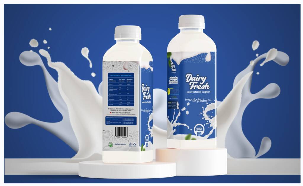
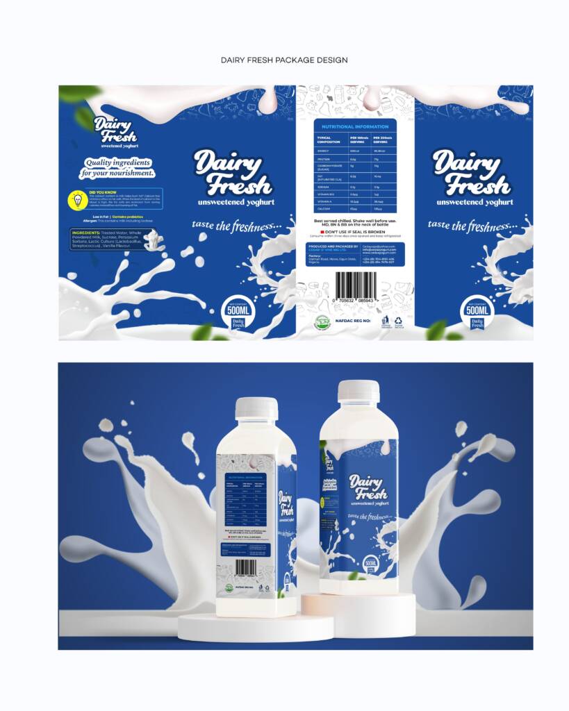
- The primary brand color, deep blue, was selected to convey trust, freshness, and dairy purity.
- We incorporated milk splashes and smooth, flowing elements to represent creaminess and indulgence.
- Flavor Differentiation:
- Each flavor was assigned a distinct yet harmonious color accent to distinguish them at a glance:
- Unsweetened: Deep blue with white elements to signify purity and natural essence.
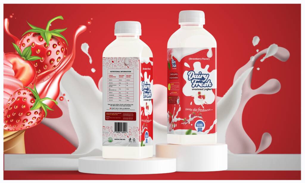
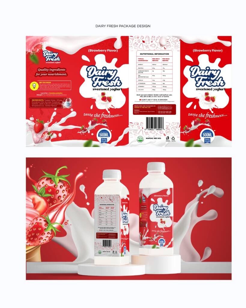
- Strawberry: A soft red-pink hue to reflect the fruity sweetness.
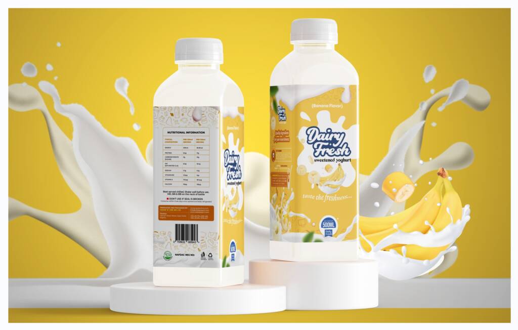
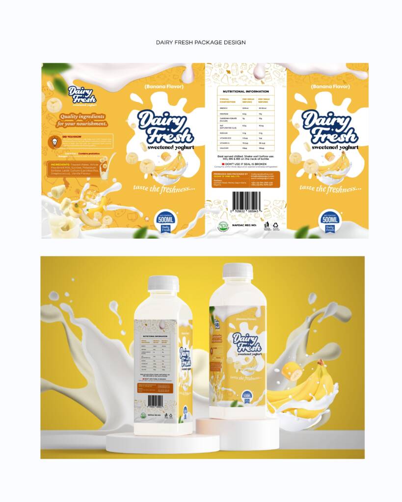
- Banana: A warm yellow tone symbolizing the rich, creamy banana taste.
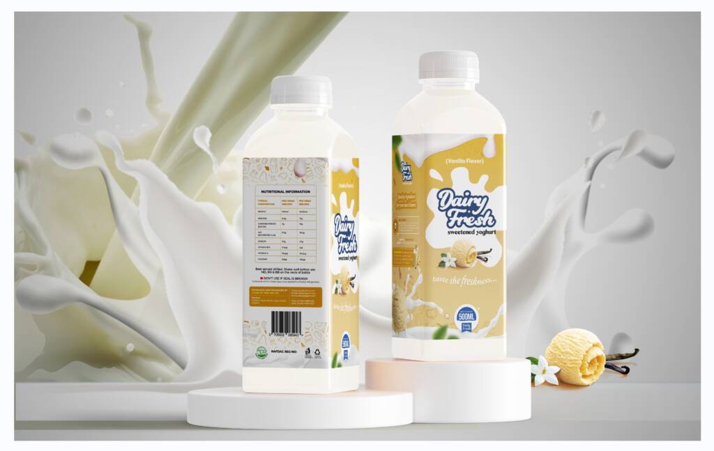
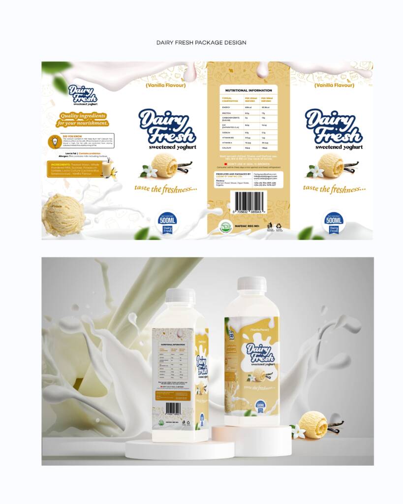
- Vanilla: A subtle off-white or beige tint for a refined and classic vanilla appeal.
- A sleek bottle label layout that enhances brand appeal and professionalism.
- Each flavor was assigned a distinct yet harmonious color accent to distinguish them at a glance:
- Typography & Messaging:
- The logo was designed with a bold, modern font to ensure visibility and brand recall.
- A tagline, “Taste the Freshness”, was added to reinforce the brand promise.
- Clear product labeling, including flavor name, nutritional information, and storage instructions, was incorporated to provide transparency to consumers.
- Consumer-Friendly Design:
- The bottles were designed with ergonomic considerations, making them easy to handle.
- The use of high-resolution imagery and smooth gradients enhanced the premium look and feel.
- Regulatory details, barcodes, and certifications were strategically placed for clarity without disrupting the visual appeal.
RESULTS
The final Dairy Fresh package design successfully met all client objectives, delivering:
- Striking Shelf Presence: The combination of bold colors, modern typography, and vibrant imagery ensures strong shelf appeal, making Dairy Fresh stand out in retail spaces.
- Cohesive Brand Identity: The packaging maintains a uniform look across all flavors while allowing each to have its own unique identity, enhancing consumer recognition and preference.
- Enhanced Consumer Engagement: The clear labeling, approachable design, and appealing color palette make it easier for consumers to identify flavors and nutritional benefits at a glance.
- Increased Brand Value: The new design elevates Dairy Fresh’s positioning as a premium dairy brand, reinforcing its reputation for quality and freshness.
The successful execution of this package design project underscores the importance of strategic visual branding in driving product appeal and consumer trust. Dairy Fresh is now better positioned to attract new customers and retain loyal buyers through a design that truly embodies its commitment to freshness, quality, and delicious flavors.