BACKGROUND
Nishane Boutique Hotel, inspired by the rich heritage and artistic flair of Turkey, aims to redefine the luxury hospitality experience. “Nishane,” which means “target” in Turkish, symbolizes the hotel’s vision of providing a sanctuary that marries tradition with modern luxury. The hotel was born from the founders’ ambition to create an elevated, intimate experience that surpasses the expectations of a diverse clientele. From the elegance of its design to the warmth of its atmosphere, every element of Nishane is crafted to reflect a space where dreams are realized.
THE BRIEF
To develop a comprehensive brand identity that reflects Nishane Boutique Hotel’s core values of tradition, luxury, and intimacy, while standing out in a competitive market. The brand identity should attract a sophisticated,

REQUIREMENTS:
- Visual Identity: Design a logo, color palette, typography, and visual elements that embody luxury, heritage, and exclusivity.
- Brand Messaging: Craft a tagline, mission statement, and key messages that align with the hotel’s values, focusing on tradition, modern luxury, and intimate guest experiences.
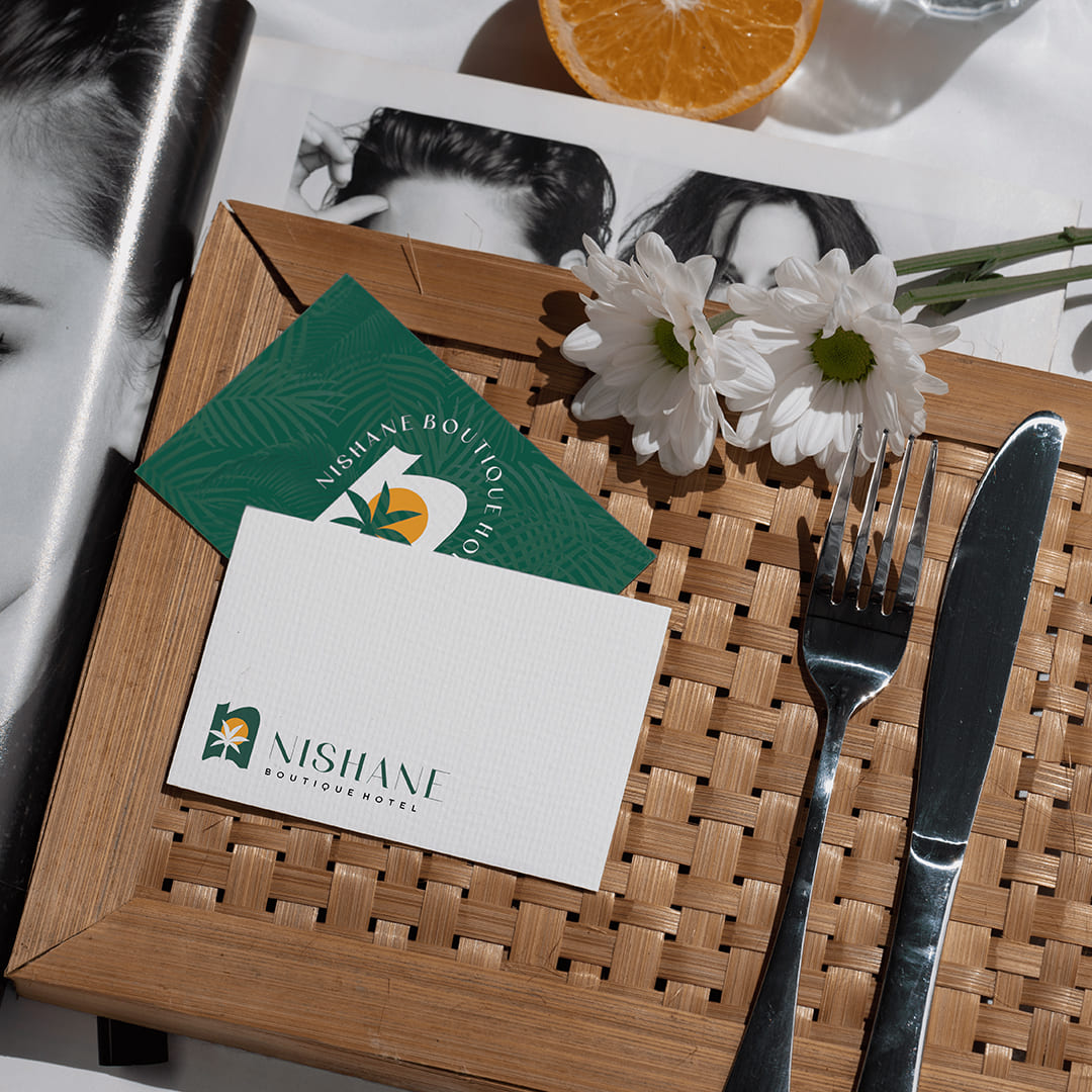
- Collateral Design: Create business cards, brochures, signage, and digital assets that align with the new brand identity and enhance the guest journey.
- Color Scheme: Choose colors that exude warmth, sophistication, and connection to cultural heritage, with a focus on timeless luxury.


OUR APPROACH
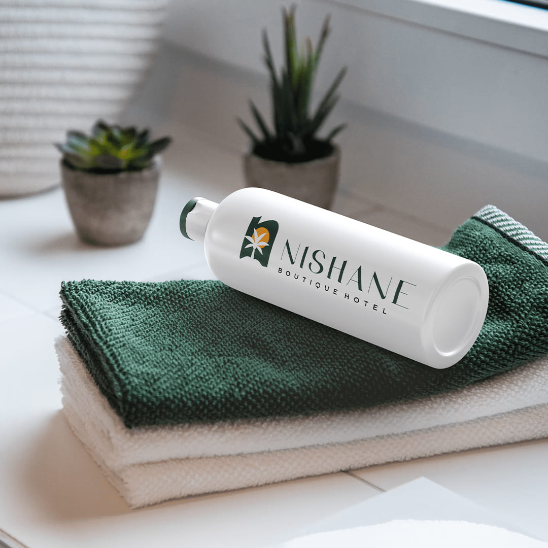
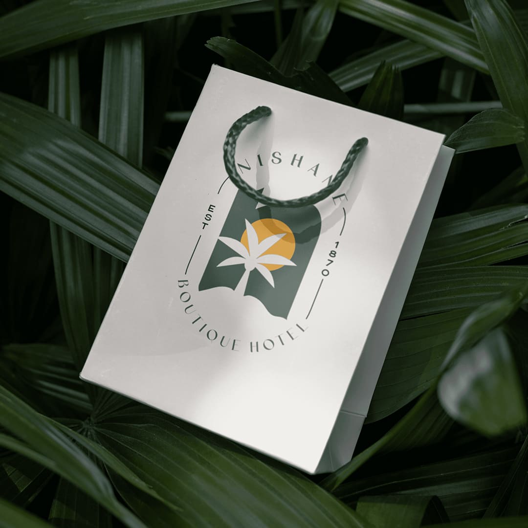
The NISHANE Boutique Hotel logo is a visual symphony that artfully encapsulates the essence of transforming dreams into reality. At its core is a mesmerizing sunset, gracefully unfurling its warm hues of sunset yellow across the canvas. This celestial display serves as a metaphor for the hotel’s promise to turn every guest experience into a magical moment, bathed in the enchanting glow of possibilities.
The silhouette of palm trees, rendered in a rich Posy green, dances against the backdrop of the sunset, creating a captivating contrast. These palm trees not only symbolize the idyllic setting of the hotel, nestled amidst nature’s tranquility, but also embody growth and vitality.
The careful selection of colors is deliberate – the sunset yellow signifies warmth, joy, and the promise of new beginnings, while the Posy green reflects the hotel’s commitment to environmental harmony and luxurious natural surroundings.
The sleek typography complements the scenic imagery, exuding elegance and sophistication.
In essence, the NISHANE Boutique Hotel logo is a masterful and artistic composition that invites guests to step into a world where dreams unfold against the canvas of a captivating sunset meeting an enchantment of a dreamlike oasis, and every moment becomes a crafted reality of beauty and serenity

THE RESULT
The rebranding resulted in a cohesive, visually striking identity that elevated Nishane Boutique Hotel’s market presence. The logo and color palette created a strong visual appeal, while the brand messaging resonated with the target audience, emphasizing luxury and personal connection. The refined identity attracted a more diverse clientele and increased bookings, positioning the hotel as a unique destination in the luxury hospitality sector.


